As seen in Brownstoner
Rauch Architecture was approached by a family with a desperate need for more space in a multifamily unit brownstone in Park Slope. Their kitchen and living room spaces were in the garden level of the townhouse, and their bedrooms were crammed into the back half of the parlor level of the townhouse. When the owners found out that they were soon to be parents of twins, in addition to their growing young son, they knew they needed more space. Luckily, the next floor of the brownstone was becoming available soon, so they decided to do a vertical combination to make more space for their growing family.
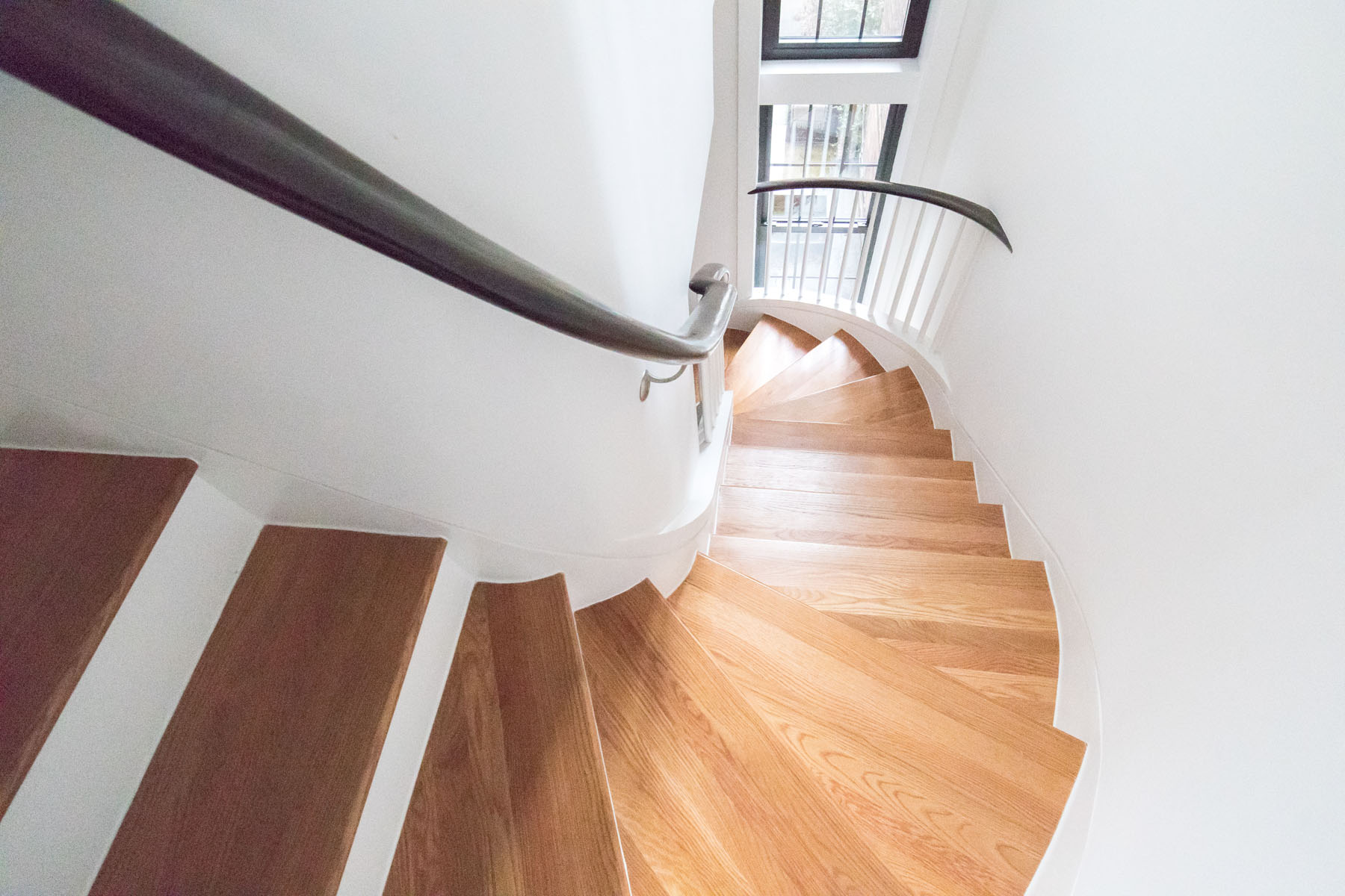
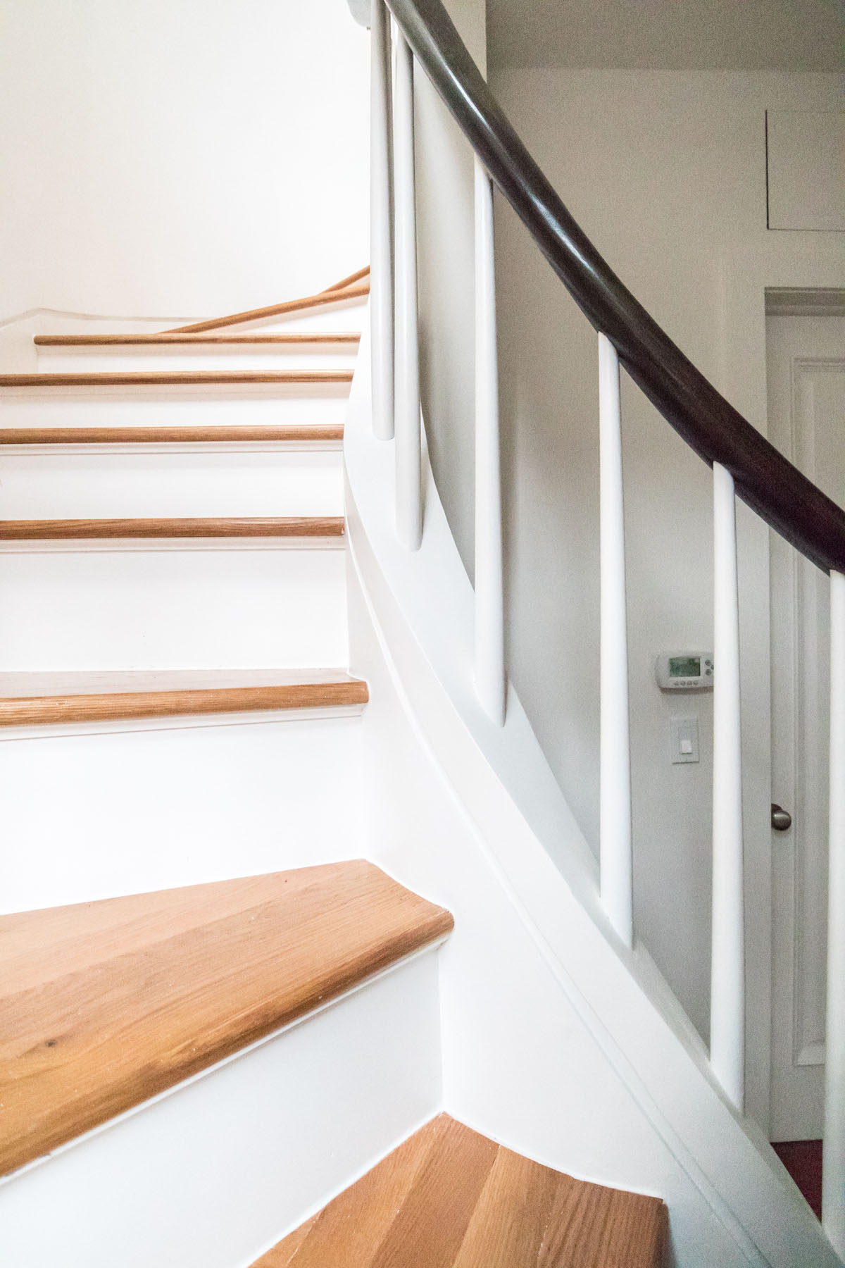
The concept was to relocate all of the bedrooms to the next floor, with the primary bedroom suite at the rear of the house, and the twins room and the eldest son’s room at the front of the house. Working around the existing plumbing risers and an existing bathroom so as not to disturb the building systems for the other residents, Rauch Architecture designed a new curving staircase to connect the existing parlor level to a new bedroom level.
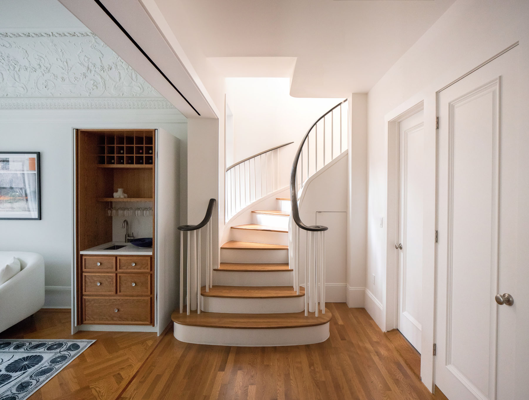
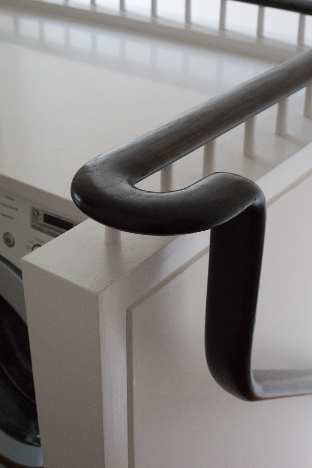
This new staircase fit seamlessly with the historic detailing of this iconic brownstone, and also created a number of unique new, efficient spaces for the family. One of the most unique and useful spaces is perhaps the new “laundry loft” at the top of the stairs, which allows a space to do laundry while overlooking a double height space next to the windows.
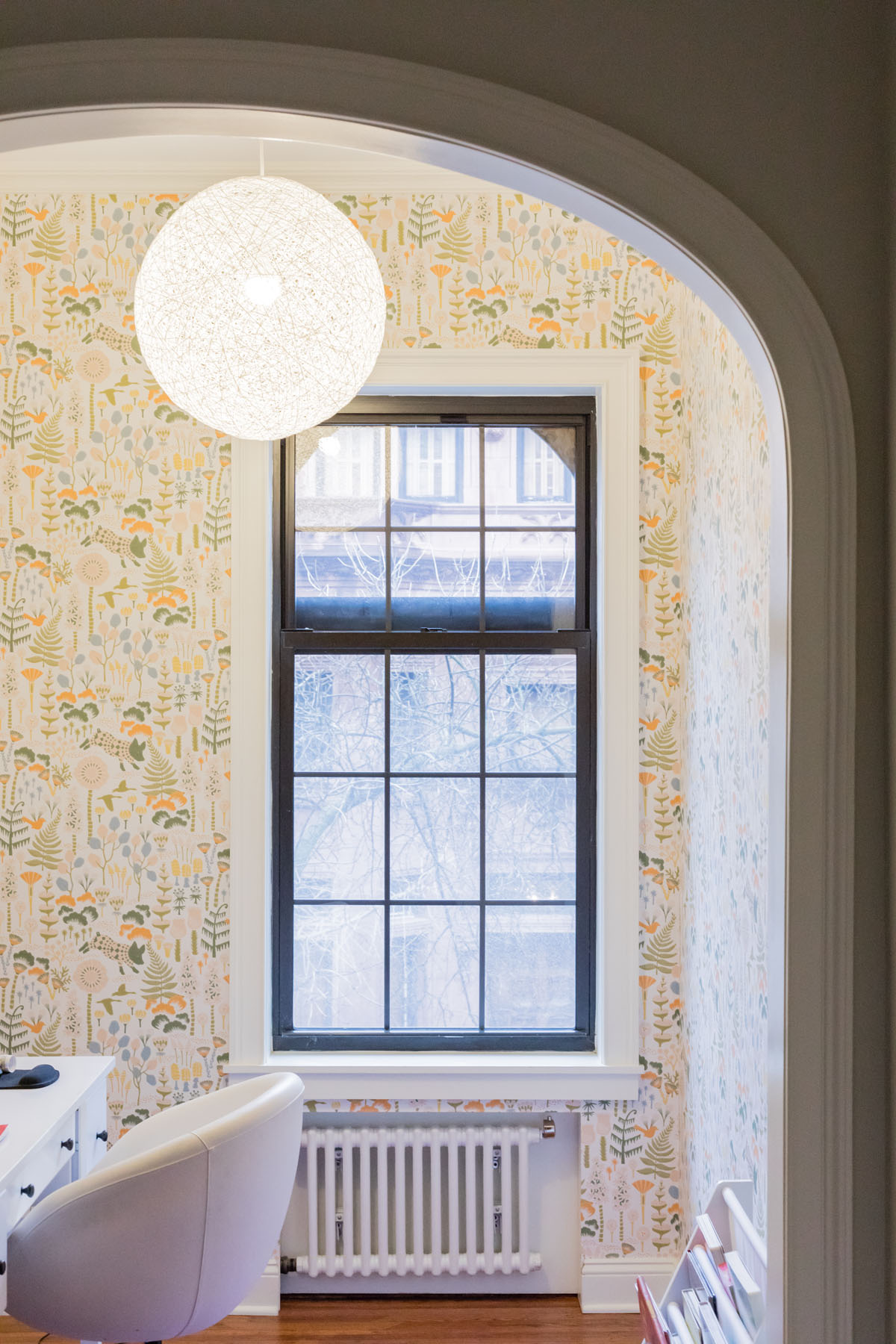
In order to create a bedroom that be “equal” for both of the twins sharing a room, we created a layout that was symmetrical across a 45 degree access to the windows, with an arched alcove serving as a shared playroom by the window. For the time being, while the twins are young, the space serves as an office for the owner’s work from home days.
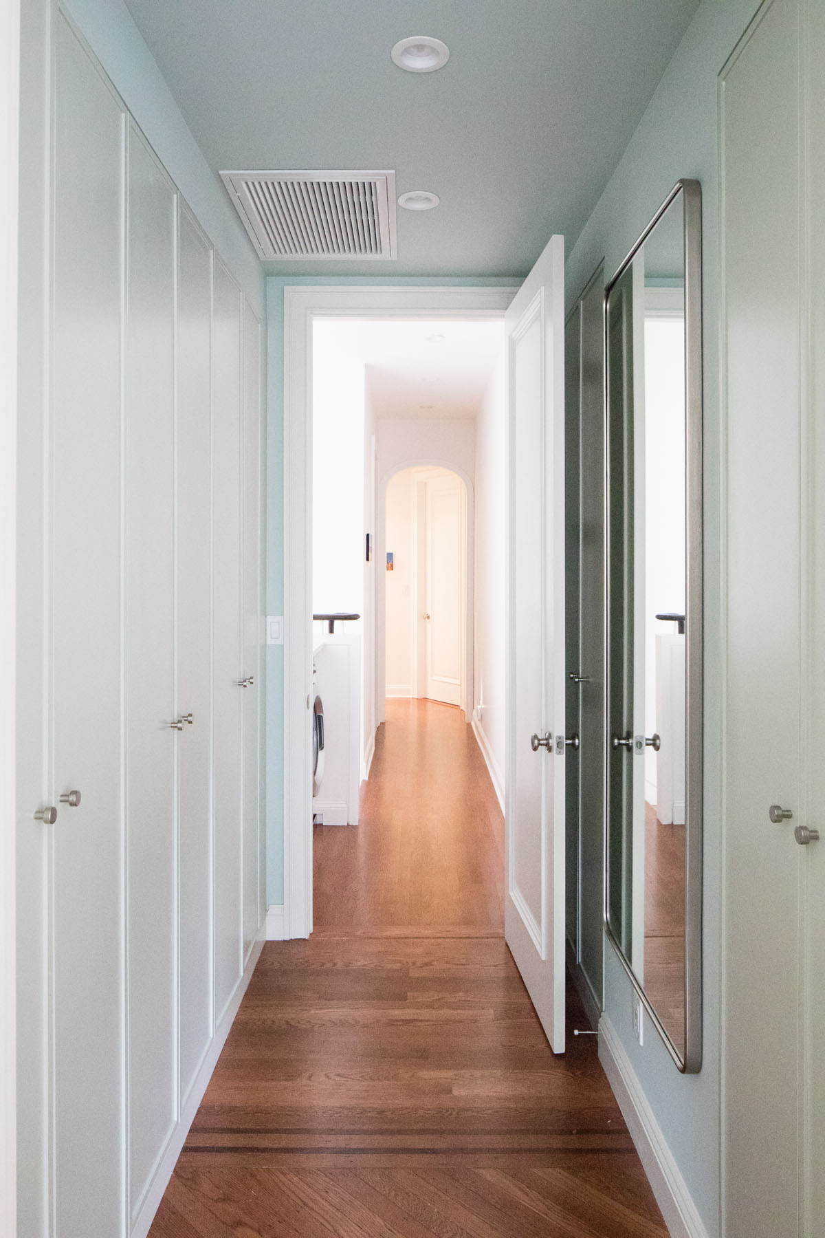
One of the main challenges when creating bedrooms for brownstones with a narrow footprint is to create privacy while also maximizing the usable space. Rauch Architecture achieved this goal by placing a dressing room at the entrance to the bedroom, separated by pocket doors, which we lined with Ikea closets and custom fronts. This created a luxurious dressing room feeling while also creating a sense of privacy and separation from the rest of the house.
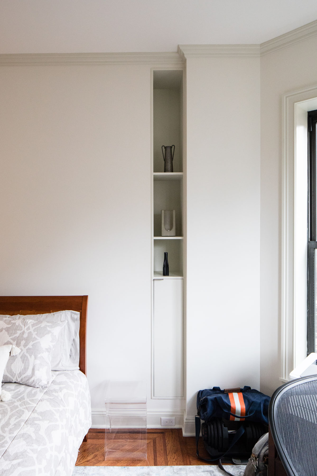
Custom built-ins disguise the space of the former fireplace location and frame the bed with a place for the display of objects and books.
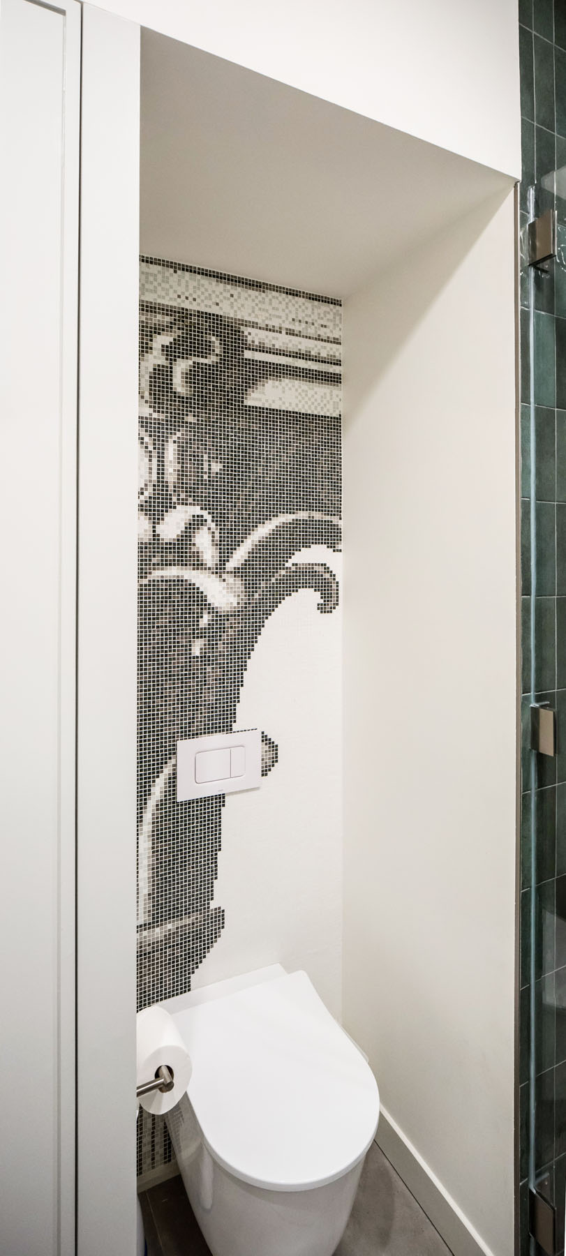
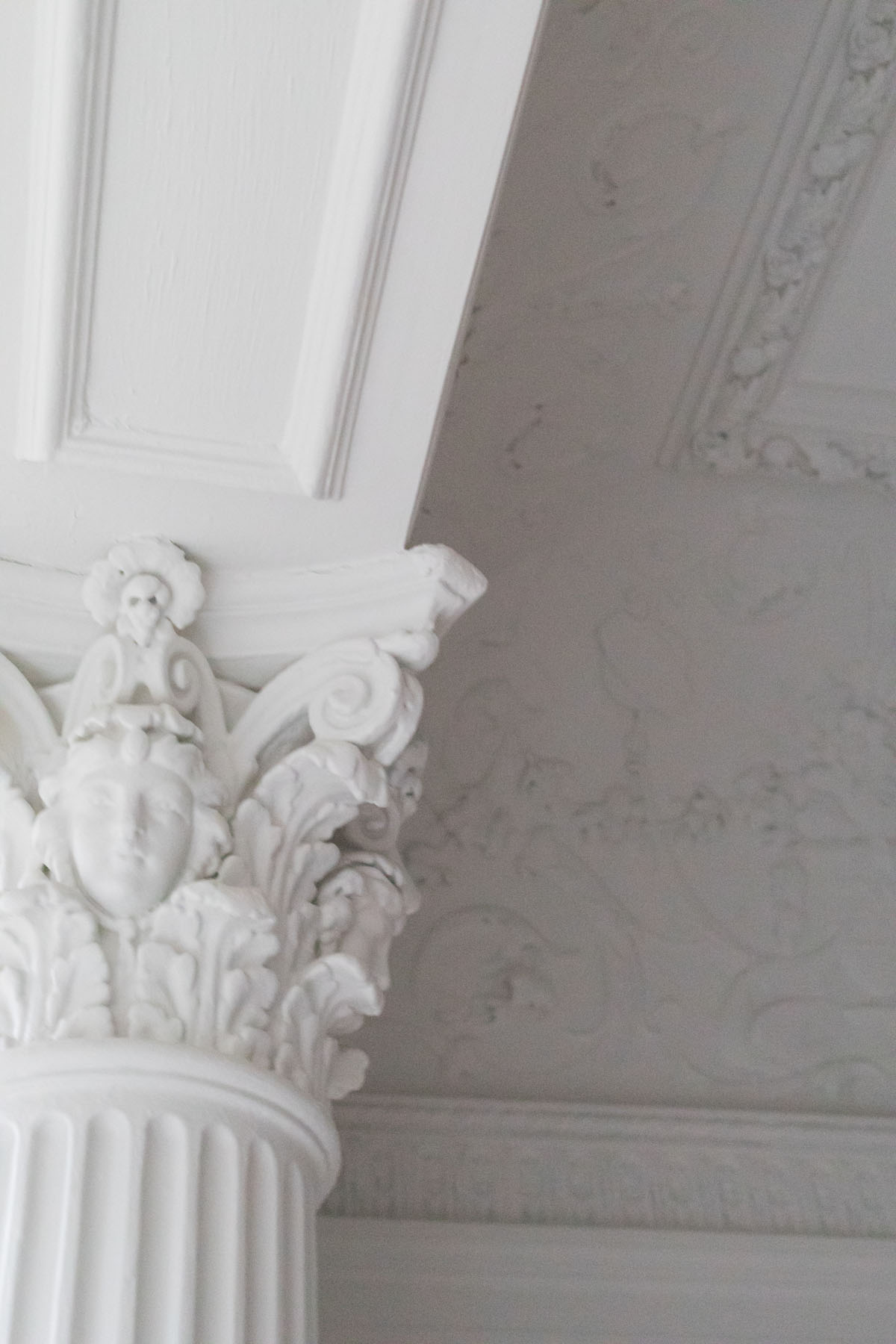
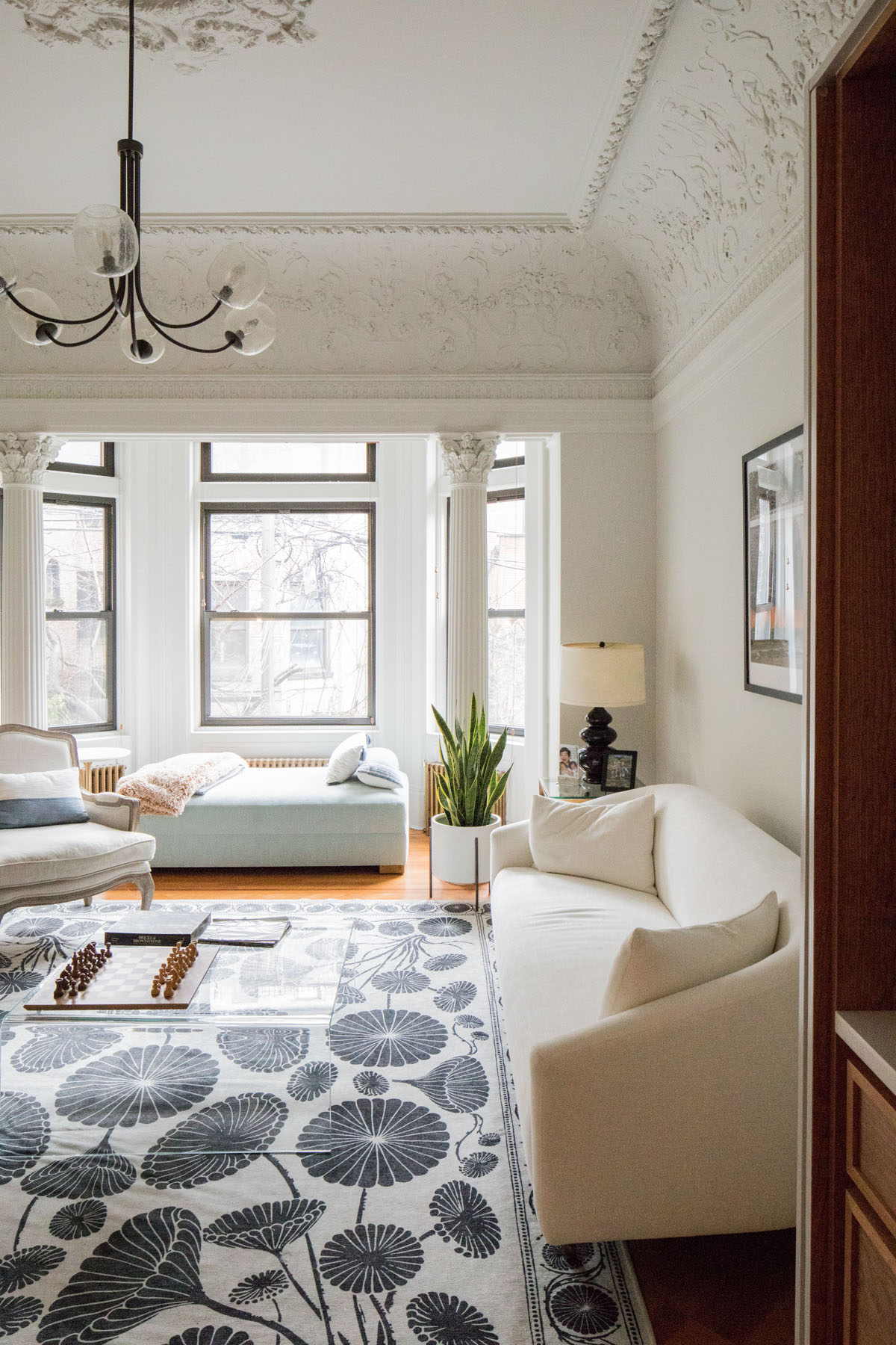
The primary bathroom features a custom mosaic that references the historical plaster reliefs and detailing evident in the main living space at the rear of the garden floor.
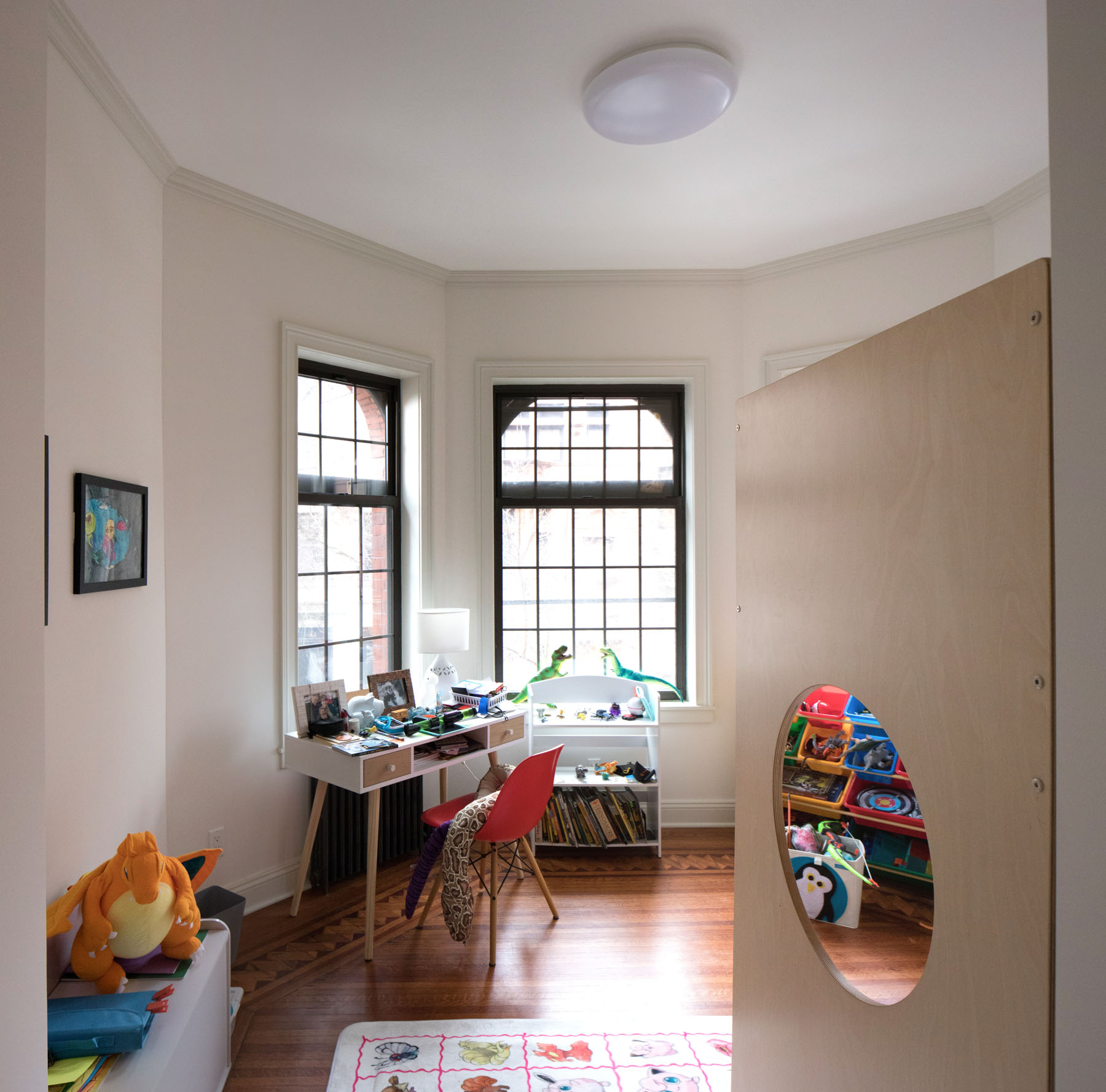
The eldest son’s room features a custom bunk bed to maximize the usable area, and it also happened to be located right at the front bay window, making it one of the best rooms in the house with a beautiful view of the street.
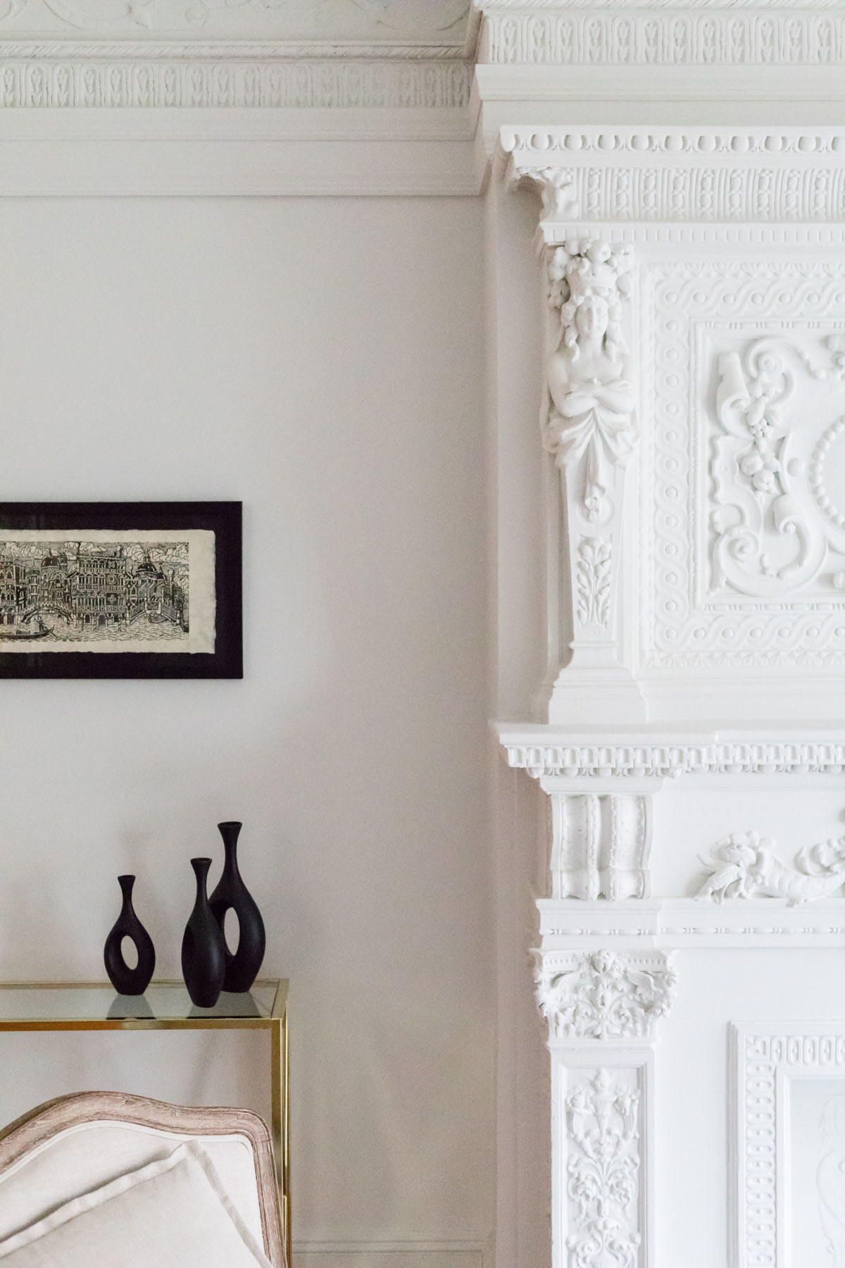
Most of the entire block was designed by C.P.H. Gilbert, and features an eclectic range of buildings with Romanesque, Dutch, and Queen Anne details that, according to the New York Times, represents the architect’s “randy, untamed and confounding vision of the urban dwelling.” One journalist, Christopher Gray, calls the architect’s Brooklyn work “a rugby scrum: the houses tangle and tussle with one another like cats and dogs in a burlap bag.” Though we love these descriptions, in our view the eclecticism and detail on display on the block is truly inspiring, a testament to the power of non-ideological thinking in creating a non-uniform harmony in the urban environment that resonates as greater than the sum of its individual parts. Our addition to this block hopefully furthers this legacy to create a timeless and unique space that will stand the test of time.