As featured in the Wall Street Journal
Rauch Architecture worked with Kate Mazza of Mazza Collective to renovate the interior of this classic 1925 Tudor Home in Montclair, NJ. The goal of the renovation was to streamline and modernize the interiors while respecting and staying true to the history and character of the existing spaces.
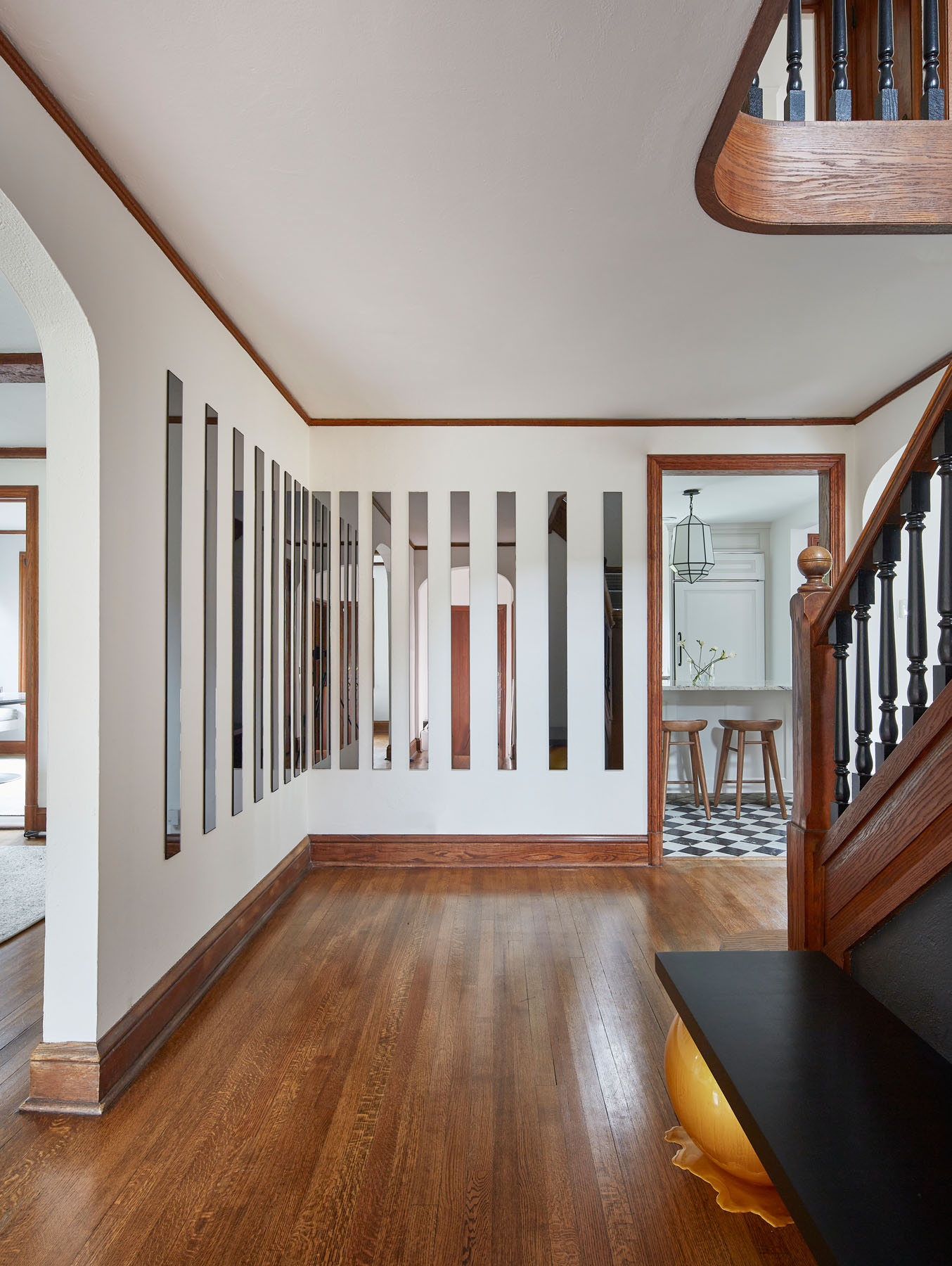
As art collectors, the clients wanted a bright, airy space where they could showcase their collection. Immediately upon entering the home, visitors are greeted with a custom mirrored art installation that extends the space visually and reflects light deeper into the otherwise window-less space.

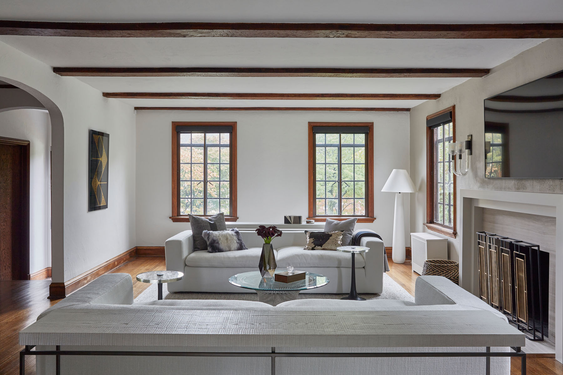
In the living room, the existing exposed beams and moldings were refinished, the fireplace received a new stone surround.

The dining room features a round rug, round table, and round fixture, creating a better flow for this central space in the house.
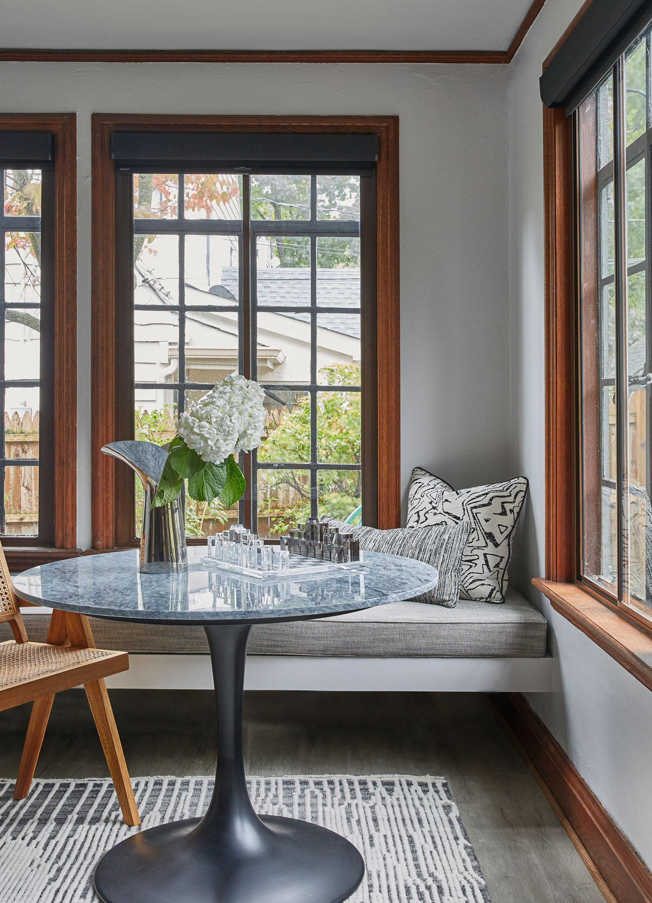
A breakfast nook / banquette was created to take advantage of the corner windows and the view of the garden, while also maximizing every square inch of the space (and covering an ugly radiator).
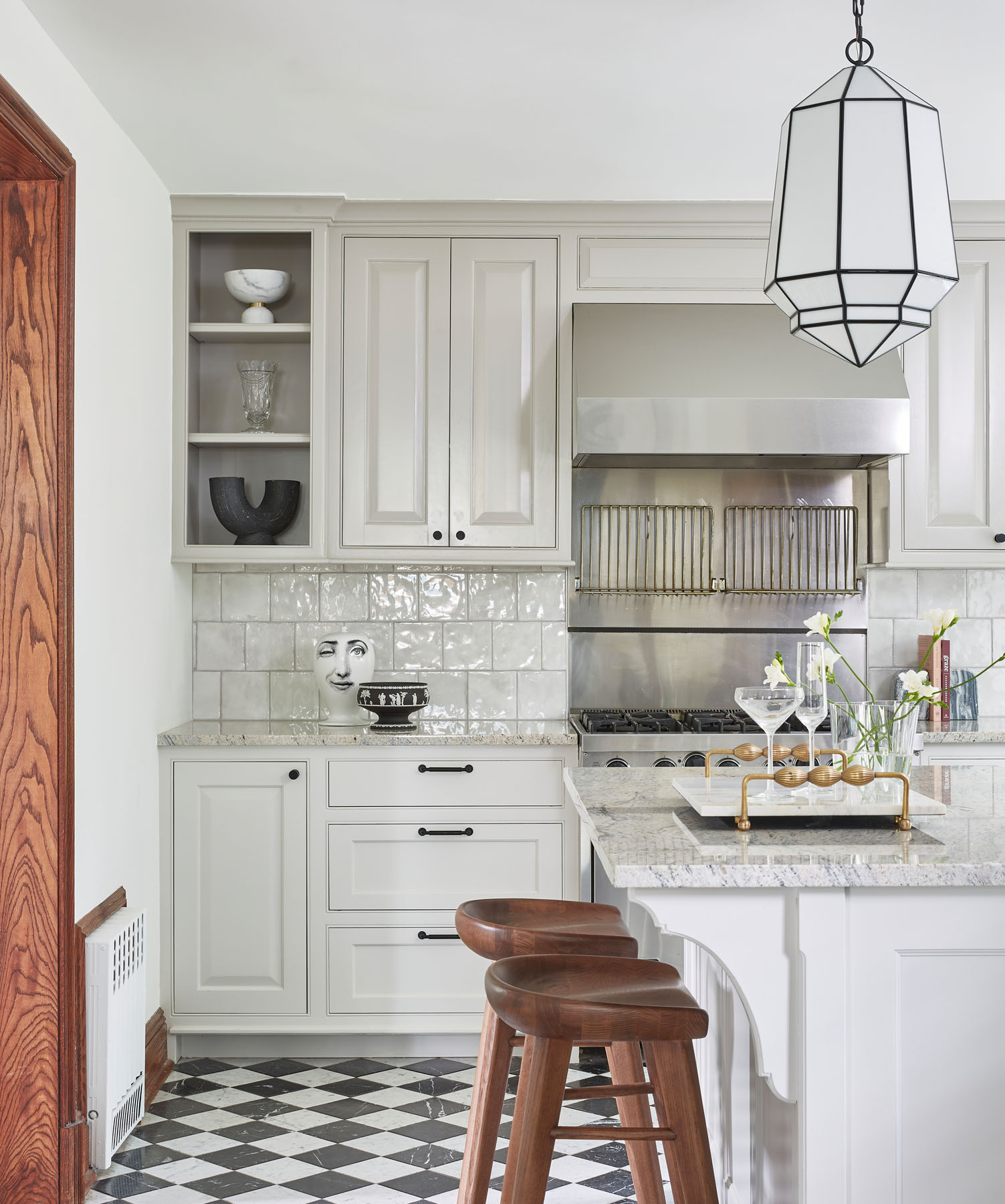
The kitchen is a showcase for how a few very simple simple moves can transform a space entirely. Thought the original checkerboard marble floors were maintained and refinished, the former yellow (!) island was repainted white and the rest of the cabinets received a very subtle tow-tone scheme that boldly reverses the more typical trend of lighter uppers and darker lower cabinets to create a much more contemporary, thoughtful millwork scheme.
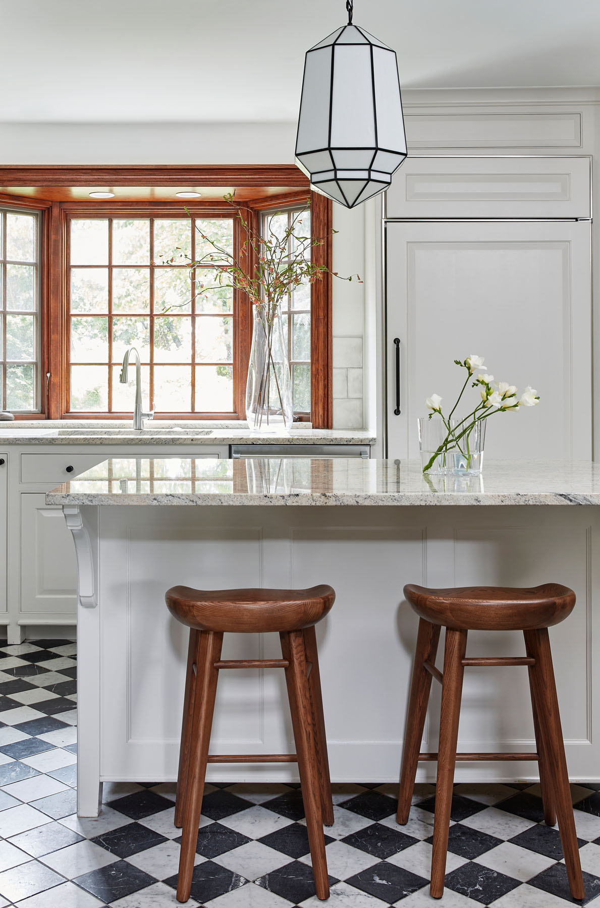
The countertops were also changed to a much lighter marble color to freshen up the space and reflect light throughout the kitchen.
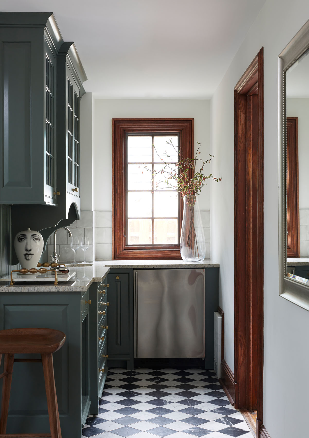
A butler’s pantry extends the usable space in the kitchen and serves as a bold, colorful counterpoint to the rest of the more muted kitchen scheme.
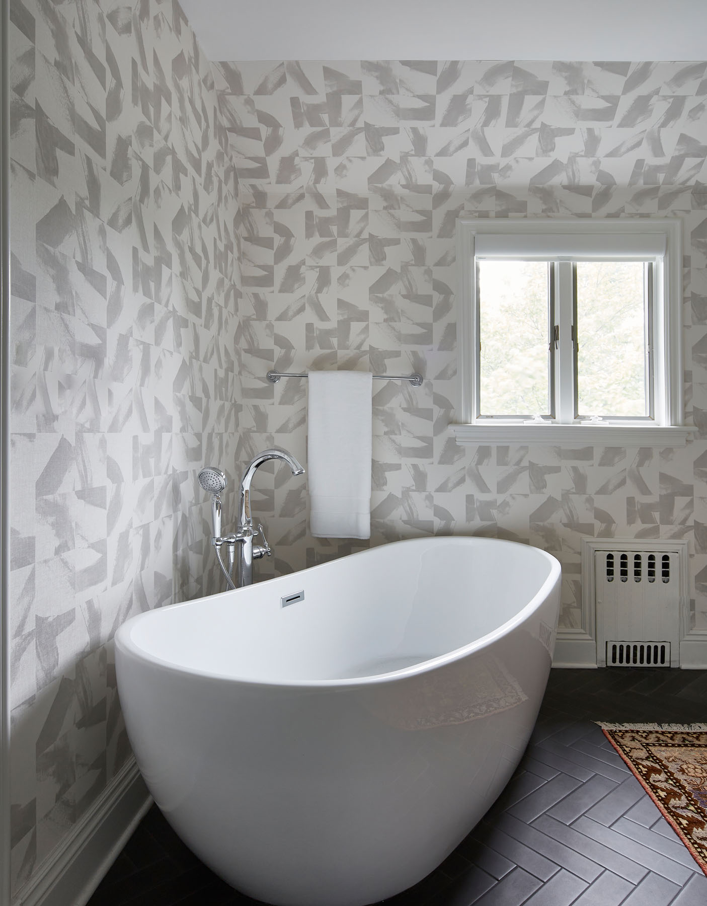
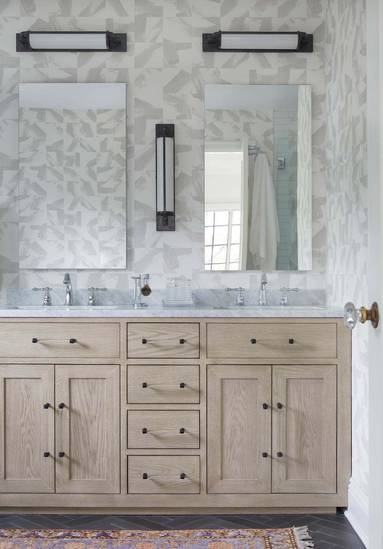
The bathroom features a fun herringbone floor tile pattern and a playful wallpaper, and a freestanding tub and new custom white oak vanity with marble countertops anchor the space.
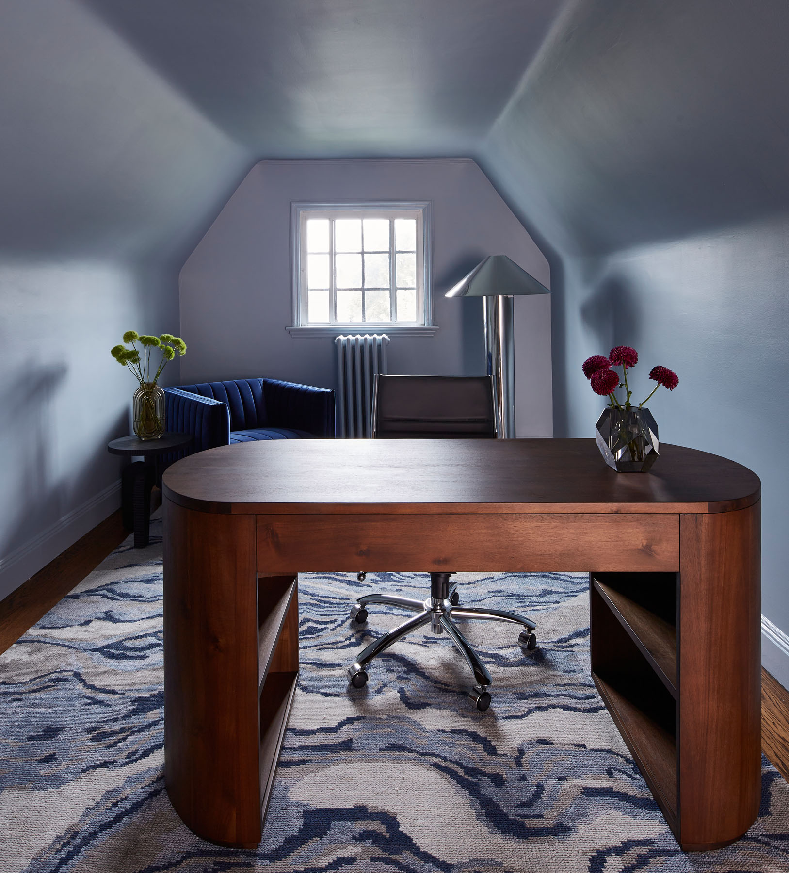
Our renovation sought to make the most of every space, even the leftover space at the very top of the house in the in the third floor attic. Here, we painted the space a pale lilac color, making it a hidden workspace oasis that truly feels like one of the most unique spaces in the house.
